A bit a of warning: I love my iPhone. But I've only had three smartphones in my life: an HTC Fuze, and iPhone 4, and an iPhone 5. After how truly awful the HTC was, the iPhone 4 was just amazing to me. And the iPhone 5 was even better. I've never had an Android phone so I have no baseline to compare the iPhone to an Android. I've heard good things about the Samsung Galaxy series. But it'll take a lot to get me to give up my iPhone.
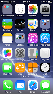
As I said, I've had iOS 7 for about 24 hours now and my first impression is: I like it, but it's not an amazing upgrade. They seem to have simplified the graphics giving them almost a cartoonish look perhaps to speed up the processing and thus the phone (it does seem faster). It uses a lot of transparency which can be distracting (even if it looks cool). And it has this cool thing where the background picture (wallpaper) moves in relation to how the phone is moved, giving it a 3-D effect. But after about a day or two, I suspect no one will care. There's a lot of other graphic silliness that will soon fail to impress. And some of the sounds have changed.
What I like
I like the way you shut off apps better. Anytime on an iPhone you close an app (by hitting the home button) it is still present in the background and my OCD nature is driven nuts by knowing there were there. So I will close an app, then hit the home button twice to completely close the apps (not sure what the correct technical terms for these functions are) and then hit the home button again to get back to the home screen. And I did that a lot, often after having only one app closed but lurking in the background. The new method you hit the home button twice like before, but now the apps are to the side and you flick them up to close them completely. It's faster then holding one down until they wiggle then touching the "x" on all of them to close them. Plus, to get back to the home screen, you touch it on the screen, not hit the home button. Which means I'm hitting the home button 1/3rd less times meaning it might not wear out as fast as it did on my iPhone 4.I like how Safari now handles multiple webpages, seems faster and easier to use.
Typing seems easier and more accurate. They have put the security code input on one screen by itself so the buttons are bigger and farther apart. I used to have a lot of trouble typing the code in if I did it quickly. Since I've gotten iOS 7 I've miss-typed it only once. And for texts and emails the typing seems better. I used to almost always hit the backspace when trying to type an "L" or "M" but I haven't done that since upgrading. While I don't like how the calculator looks, it seems I make less operator errors (hitting x instead of +, for example).
What I don't like
I wish I could change the color schemes on the text messages as the simple blue and white scheme seems too plain. And Siri sounds more human (and comes with a male voice option) so she seems to have lost some of her quirky charm. And they've changed a bunch of the icons so you have to re-learn what the icons mean. That's a bit annoying. Putting an appointment in the calendar seems to be an exercise in frustration because the rollers for changing date and time aren't distinct and I found myself moving the whole screen trying to move a roller. A little over-simplified.Some of the old cool effects are gone. For instance, when you delete and email is zooms down and gone very fast. I like the way it seemed to get sucked into the garbage bucket in the old OS. I have to admit, it's faster. And if I leave the mail app in an email, when I get new mail and re-open it, it opens in that email, not in the inbox. I don't remember the old OS doing that.


No comments:
Post a Comment